
Designing a Multi-Surface Navigation System for Confidence, Reliability, and Scale
Transforming campus navigation from a mapping feature into a trust-centered, cross-device system.
- 12 weeks
- Lead Product Designer
- Tampere University
- iOS, Android, watchOS
Outcome Highlights
✸
Increased first-attempt navigation success
✸
Reduced wayfinding support dependency
✸
Decreased hesitation at entrances and transitions
✸
Scalable cross-surface architecture
Context
Tampere University operates across multiple campuses with complex building layouts, disconnected entrances, inconsistent naming conventions and Limited indoor GPS reliability.
Before TUNI Compass:
- Students relied on static PDF maps
- Google Maps did not accurately reflect internal pathways
- Support staff regularly answered repetitive navigation questions
- First-year and international students struggled disproportionately
The initial request was:
“Build a campus navigation app.”
This framing was feature-oriented and solution-constrained.
Problem Reframing
Rather than accepting the request at face value, I conducted exploratory research to understand failure points.
Through interviews with first-year students, guerrilla testing on campus, analysis of orientation-period questions, and shadowing students navigating between lectures, I discovered that students were often able to locate buildings on maps - yet still failed to reach destinations confidently.
But they failed at decision points.
Students hesitated:
- At entrances
- At corridor splits
- During floor transitions
- When unsure if they had arrived
This hesitation led to second-guessing, delays, and external help-seeking.
The real problem was not information access. It was confidence under uncertainty.
Reframed Problem Statement
"How might we increase first-attempt navigation success by reducing uncertainty at critical decision points?"
This shifted the product from a mapping tool to a confidence system.
Key Behavioral Insights
Through structured interviews, guerrilla testing during live campus transitions, and real-time shadowing of students navigating between lectures, I focused on identifying behavioral breakdown patterns rather than usability complaints.
Across participants, hesitation emerged as the dominant friction signal, but it was not random. It followed repeatable patterns.
1. Navigation Friction Is Episodic, Not Continuous
Students moved confidently along straight paths. Hesitation clustered at decision nodes.
These included:
- Building entrances with multiple doors
- Corridor intersections
- Elevator vs. stair junctions
- Floor transitions
- Areas where signage was present but ambiguous
At these points, observable behaviors included:
- Sudden stopping
- Looking back and forth between physical signage and phone
- Rotating in place to reorient
- Taking a few steps, then reversing direction
- Asking nearby peers
Importantly, these behaviors were consistent across different buildings.
Insight
Navigation breakdowns are not caused by distance - they occur at branching moments where directional commitment is required.
System implication
The experience must prioritize reducing cognitive load at decision points rather than optimizing the entire route equally.
2. Certainty Outweighs Efficiency
When asked what they wanted, students frequently answered:
“The shortest route.”
However, observed behavior contradicted this preference.
Students consistently chose:
- Well-lit, main corridors over shortcuts
- Familiar paths over optimal ones
- Routes with visible landmarks
- Areas with higher pedestrian flow
Under time pressure, they defaulted to:
“I’ll take the way I know.”
This indicates a gap between stated preference and behavioral truth.
Insight
Users prioritize perceived certainty over theoretical efficiency.
System implication
Navigation systems must optimize for confidence reinforcement - not just path minimization.
3. Spatial Hierarchy Confusion Drives Cognitive Load
Students struggled less with locating room numbers and more with understanding spatial context.
Common breakdowns occurred during:
- Outdoor-to-indoor transitions
- Identifying the “correct” entrance among many
- Determining which floor wing corresponded to a classroom
- Interpreting inconsistent building naming conventions
In multiple cases, students said:
“I think I’m in the right building… but I’m not sure.”
The uncertainty was hierarchical - not directional.
Insight
Navigation friction increases when spatial hierarchy is unclear (Campus → Building → Floor → Block → Room).
System implication
The system must reinforce hierarchical orientation continuously, not just provide a destination marker.
4. Time Pressure Amplifies Ambiguity
When running late:
- Students scanned less
- Relied less on dense maps
- Abandoned signage faster
- Asked others for confirmation
- Increased walking speed, reducing environmental awareness
Under stress, tolerance for ambiguity dropped sharply.
Insight
Navigation systems must reduce ambiguity rapidly under high-pressure conditions. Confidence must be established quickly, not gradually.
System implication
Critical information must be immediately visible and decision-focused - not layered behind exploration.
5. Social Fallback Is a Signal of System Failure
A repeated pattern emerged: When uncertainty exceeded a threshold, students sought external validation.
They:
- Asked peers
- Followed groups
- Approached administrative desks
This behavior occurred even when maps were available.
Insight
Help-seeking is not laziness - it is a coping mechanism for uncertainty. Reducing hesitation can reduce dependency on human assistance.
System implication
Success should be measured not just by arrival time, but by reduction in external validation behavior.
Synthesis
These insights revealed a consistent pattern:
Students do not fail because they lack maps.
They fail when ambiguity exceeds their confidence threshold.
Navigation is therefore not a mapping problem. It is a trust calibration problem.
Reducing hesitation at high-friction nodes became the primary design focus – shifting the product from directional assistance to confidence reinforcement.
Role & Ownership
Role: Lead Product Designer
Duration: 12 weeks
Scope: End-to-end navigation system strategy and experience design
TUNI Compass began as a scoped feature request: “Build a campus navigation app.” I expanded the initiative from a mapping feature into a behavior-driven navigation system focused on reducing decision-point hesitation and increasing first-attempt success.
Ownership Boundaries
To clarify scope:
I owned:
- Research direction
- Experience strategy
- System architecture
- Interaction design
- Validation synthesis
I did not own:
- Backend infrastructure implementation
- University facility data management
Strategic Ownership
I led the project from ambiguous framing through validated system definition.
This included:
- Conducting exploratory research and live campus observation
- Reframing the problem around confidence under uncertainty
- Defining behavioral success metrics
- Establishing design principles grounded in observed patterns
- Translating research insights into product-level implications
Rather than executing against predefined requirements, I shaped the product direction itself.
System & Experience Leadership
I owned the experience strategy and system architecture, including:
- Defining the spatial hierarchy model (Campus → Building → Floor → Block → Room)
- Structuring decision-node reinforcement logic
- Designing cross-surface interaction consistency (iOS, Android, watchOS)
- Balancing reliability constraints with user confidence needs
- Defining trade-offs between efficiency, cognitive load, and scalability
This ensured continuity from behavioral insight → structural model → interaction design.
Decision Authority
I drove critical product decisions including:
- Prioritizing confidence reinforcement over shortest-path optimization
- Defining first-attempt navigation success as the primary metric
- Limiting scope to high-impact friction points instead of feature expansion
- Structuring success measurement around hesitation reduction
These decisions required balancing:
- User behavior vs stated preference
- Technical feasibility vs experience clarity
- Short-term delivery vs long-term scalability
Cross-Functional Collaboration
I collaborated closely with:
- Engineering stakeholders (indoor GPS limitations, feasibility constraints)
- University staff (orientation workflows, support burden patterns)
- Student participants (validation and testing)
While I did not implement backend engineering systems, I influenced feasibility decisions through architecture modeling and constraint analysis.
Design Principles
Before designing features, we defined guiding principles to avoid feature-driven expansion:
Trust over technical precision
Perceived reliability matters more than perfect positioning. Confidence drives commitment.
Reinforcement over instruction density
Clarity at decision points reduces hesitation. Subtle confirmation outperforms clutter.
Context-aware activation over persistent UI
Features appear only when needed. Noise decreases when confidence is stable.
Cross-surface consistency over feature replication
Behavior remains consistent across devices. Continuity builds trust more than feature parity.
Measure behavior, not usage
Success is reduced hesitation and help-seeking - not taps, sessions, or screen time.
Defining Success
We defined success metrics before designing any solution, anchoring evaluation to behavioral and institutional outcomes rather than interface-level improvements.
This ensured the product would be measured by reduced uncertainty - not feature adoption.
Primary Outcome
First-Attempt Navigation Success
Percentage of students reaching their intended destination without backtracking, extended hesitation, or external assistance.
This directly reflects increased confidence under uncertainty.
User Behavior Signals
Decision-Point Hesitation Frequency
Pause duration and reorientation behavior at entrances and intersections
Route Deviation Frequency
Mid-route corrections or directional reversals
Time-to-Commitment
Time taken before confidently proceeding at a decision node
These behavioral signals allow early detection of ambiguity before failure occurs.
System Signals
Navigation Confidence (Post-Task Self-Report)
Likert-scale confidence ratings after navigation tasks
Guidance Reliance Pattern
Whether users repeatedly re-check directions at the same node
Latency of Glanceable Cues
Time required for users to interpret directional guidance
These validate that the system supports rapid clarity.
Institutional Impact
Because navigation breakdown created operational burden, institutional outcomes were included:
Reduction in navigation-related support inquiries
Adoption among first-year and international students
Retention through Month 1 of semester
This ensured the system addressed ecosystem-level friction – not just user-level behavior.
Constraints & Risk Assessment
The design of TUNI Compass was strongly shaped by real-world infrastructure, technical, and behavioral constraints.
Rather than treating constraints as limitations, they were treated as product design signals that influenced system architecture and experience decisions.
The primary risk was losing user trust if navigation guidance failed in high-uncertainty environments.
Technical
Limited Indoor Positioning Accuracy
Indoor GPS reliability varied across campus buildings.
Risk -> Incorrect directional guidance could increase confusion rather than reduce it.
Design Response -> Avoid reliance on precision routing. Prioritize landmark-based guidance and confidence reinforcement.
Device Ecosystem Fragmentation
Users accessed navigation across: Mobile devices and Wearables
Risk -> Inconsistent behavior across surfaces would increase cognitive load.
Design Response -> Defined cross-surface behavioral consistency as a design principle.
Environmental
Variable Campus Architecture
Campus buildings had: Multiple entrances, Similar corridor layouts, and Limited directional signag.
Risk -> Users could misinterpret spatial orientation cues.
Design Response -> Reinforced hierarchical navigation context continuously.
Lighting and Movement Variability
Students navigated: Outdoors, and Indoor corridors, Transition zones
Risk -> Visual-only guidance could fail under different lighting or movement conditions.
Design Response -> Combined visual and spatial confirmation signals rather than relying on single-channel guidance.
Behavioral
Over-Reliance on Guidance
Risk -> If navigation became too intrusive: Users might lose spatial learning ability, System trust could degrade.
Design Response -> Reinforced hierarchical navigation context continuously.
Cognitive Overload
Risk -> Dense navigation information can increase hesitation rather than reduce it.
Design Response -> Progressive information disclosure. Minimal walking-state UI.
Adoption
First Impression Reliability
Risk -> If early experiences failed: Users would revert to existing solutions like static maps or social navigation.
Design Response -> Prioritized reliability in high-friction zones (entrances, transitions, arrivals).
Strategic
The highest systemic risk was trust degradation.
Risk -> If navigation guidance: Failed at decision nodes Provided inconsistent signals Increased user uncertainty Users would abandon the system quickly.
Design Response -> Trust was treated as a core product architecture requirement, not a UX layer.
Experience Strategy
The experience strategy for TUNI Compass was designed as a confidence progression system, rather than a traditional navigation interface.
Instead of optimizing for shortest path routing, the experience was designed to support users as their familiarity and certainty increased over time.
Navigation should feel like a supportive guide that gradually becomes less necessary as users learn the environment.
Design Response
Phase 1 - Orientation (High Uncertainty)
Target Users:
- First-year students
- International students
- Visitors
Primary Needs:
- Strong directional clarity
- Clear entrance identification
- Immediate arrival confirmation
Design Characteristics:
- Strong visual directional commitment
- Landmark-first guidance
- Reduced information density
Goal: Reduce anxiety during first-time navigation.
Phase 2 - Adaptation (Growing Familiarity)
Target Users:
- Students who have navigated campus once or twice.
Primary Needs:
- Faster decision support
- Reduced guidance intensity
- More spatial autonomy
Design Characteristics:
- Guidance becomes more subtle
- Confirmation cues replace detailed instructions
Goal: Support learning of spatial structure.
Phase 3 - Mastery (High Familiarity)
Target Users:
- Regular campus users.
Primary Needs:
- Optional navigation support
- Minimal interface presence
Design Characteristics:
- System recedes into background
- Guidance becomes glanceable and optional
Goal: Allow users to navigate naturally without system dependence.
Behavioral Reinforcement Model
The experience was designed around three behavioral outcomes:
- Reduce Uncertainty – Provide clarity at decision nodes.
- Increase Spatial Confidence – Help users build mental maps of campus layout.
- Reduce External Dependency – Minimize need to ask others for directions.
Multi-Surface Strategy
The experience was intentionally designed to adapt across devices without duplicating features.
- Mobile – Primary navigation planning and walking guidance.
- Wearables – Glanceable directional confirmation and haptic feedback.
- Future Extensions (Conceptual) – Contextual campus event navigation and accessibility enhancements.
Design Philosophy
The product was not designed as a navigation tool.
It was designed as a spatial confidence system.
The system should:
- Help users make faster decisions
- Reduce hesitation loops
- Reinforce spatial understanding over time
System Architecture
TUNI Compass was designed as a layered system rather than a collection of screens.
The architecture prioritized reliability, behavioral reinforcement, and scalable expansion across campus infrastructure.
Design Response
1. Positioning Layer
The positioning layer establishes the user’s spatial context within the campus environment.
Research revealed that many navigation failures occurred not because users lacked directions, but because they lacked context within the campus hierarchy. Students often knew their destination but were unsure where they were within the building structure.
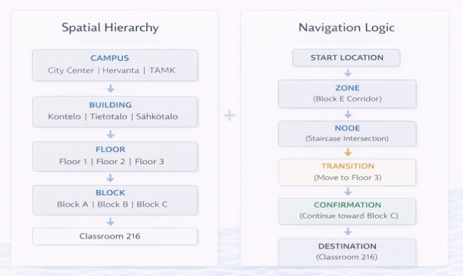
To address this, positioning is anchored to a structured spatial hierarchy that mirrors how students mentally organize the campus environment:
Campus → Building → Floor → Block → Destination
Example:
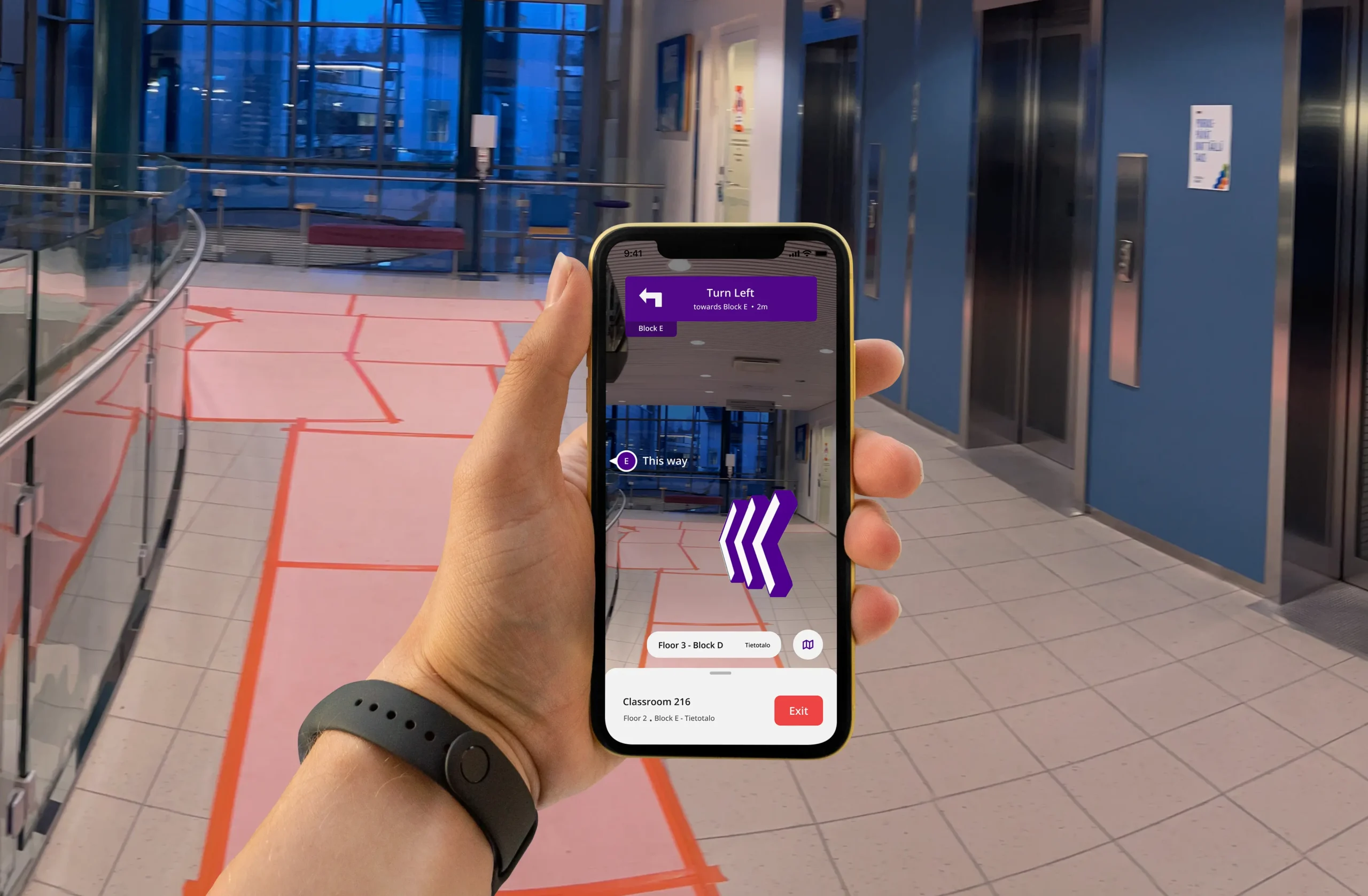
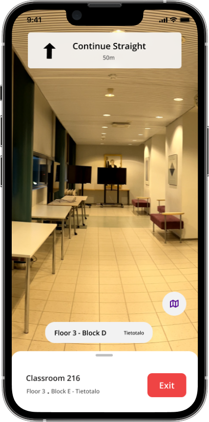
City Center Campus → Tietotalo Building → Floor 2 → Block E → Classroom 216
This hierarchy ensures that users always understand their position relative to the broader environment, not just their immediate location.
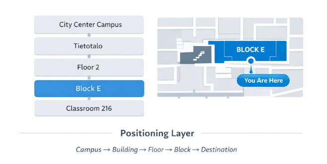
Because indoor positioning signals can fluctuate, the system avoids presenting overly precise coordinates. Instead, users are anchored within structural zones associated with recognizable landmarks, such as corridors or staircases.
This prevents the system from presenting false precision and maintains user trust even when sensor accuracy varies.
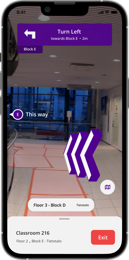
2. Navigation Logic Layer
Structuring navigation around decision points
Observational research revealed that navigation failures rarely occur during continuous movement. Students generally move confidently along corridors or open pathways, but hesitation consistently appears at decision points, such as corridor intersections, staircases, entrances, or floor transitions.
To address this pattern, the navigation system structures routes as a sequence of spatial states rather than continuous instructions.
The routing model follows a structured progression:
Zone → Node → Transition → Confirmation → Destination
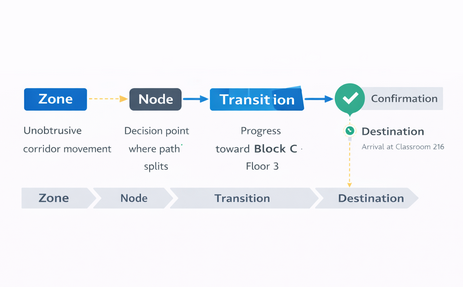
Each state represents a different phase of movement through the environment.
Zone: A spatial area where users can move freely without needing to make a decision, such as a corridor or open hall.
Node: A decision point where directional commitment is required. Typical nodes include intersections, staircases, elevators, and entrances.
Transition: Movement between nodes, such as walking along a corridor or changing floors.
Confirmation: A reinforcement signal that reassures users they are on the correct path and prevents hesitation loops.
Destination: The final arrival state where the system clearly confirms that the user has reached the intended location.
By structuring navigation around these spatial states, the system concentrates guidance at moments of uncertainty while allowing movement through simple areas to remain visually calm. This reduces cognitive load and aligns the navigation experience with how people naturally interpret physical environments.
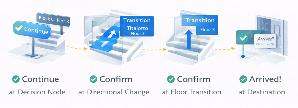
3. Behavioral Reinforcement Layer
Even when directions are accurate, users may still feel uncertain if the system does not confirm their progress.
The behavioral reinforcement layer introduces signals that validate user movement and reassure users that they remain on the correct path.
Reinforcement occurs at critical moments:
- approaching decision nodes
- completing directional changes
- reaching floor transitions
- arriving at the destination
These signals reduce hesitation loops and minimize the need for users to repeatedly verify their route.
This layer is especially important in environments where architectural layouts are repetitive and physical signage may be inconsistent.
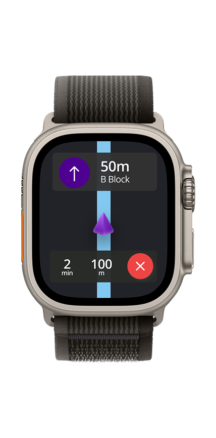
4. Surface Adaptation Layer
Navigation interactions must remain consistent across devices with different capabilities.
The surface adaptation layer ensures that navigation logic remains consistent while interface complexity adapts to the device being used.
The system supports multiple surfaces:
Mobile (iOS & Android)
Provides full spatial context, route visualization, and detailed navigation instructions.
watchOS (Wearable Companion)
Acts as a glanceable companion, providing simplified cues like Continue, Turn, or Distance remaining through minimal visuals and haptic feedback.
Both surfaces rely on a shared Navigation Logic layer, ensuring consistent guidance while adapting the interface to each device’s interaction capabilities.
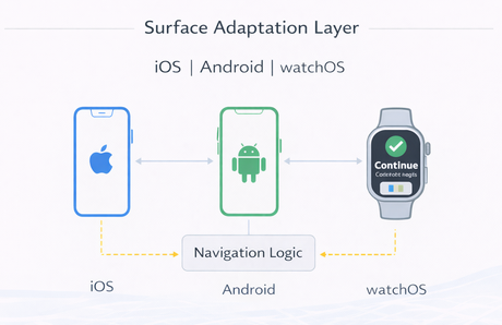
This architecture enables the navigation system to scale across devices without duplicating routing logic.
5. Scalability & Structural Resilience
The navigation architecture was designed to scale across multiple campuses, buildings, and future services without changing its core interaction logic.
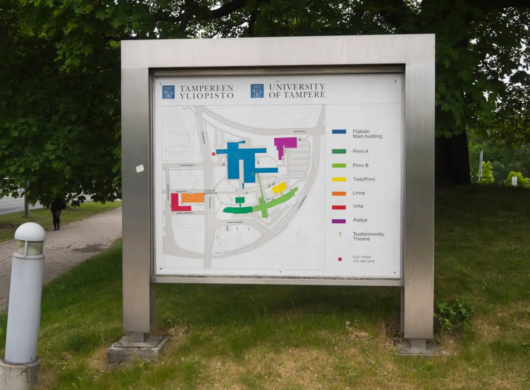
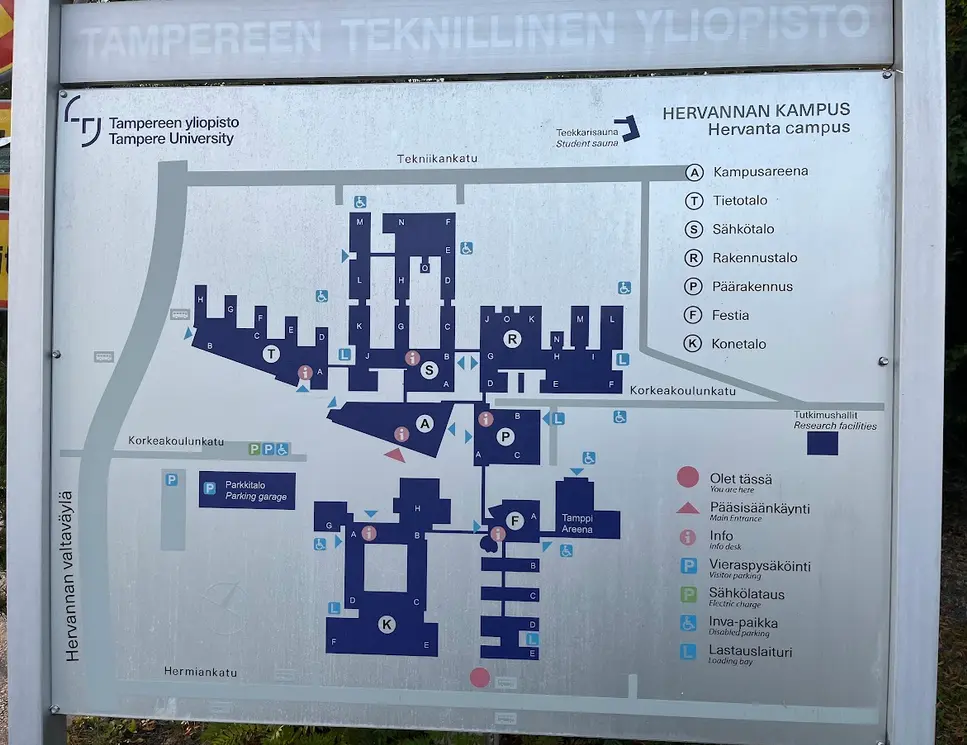
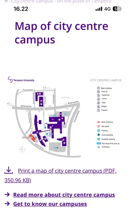
Tampere University operates across several campuses, including City Center, Hervanta, and TAMK, each with different building structures and layouts. To support this complexity, the system relies on reusable spatial and routing models.
Spatial hierarchy:
Campus → Building → Floor → Block → Destination
Navigation logic:
Zone → Node → Transition → Confirmation → Destination
Because these models are reusable, the system can support new buildings, additional campuses, and future navigation features without redesigning the interaction framework.
This structural resilience allows the navigation system to expand while preserving a consistent user experience.
Trade-offs & Strategic Decisions
Designing TUNI Compass meant being careful and intentional.
We didn’t add every feature just because it was technically possible. Some ideas were intentionally deprioritized to protect system trust, clarity, and long-term scalability.
Design Response
Not Optimizing for Turn-by-Turn Density
Possible Direction: Continuous, granular turn-by-turn instructions similar to consumer GPS systems.
Why We Didn’t:
- Indoor positioning accuracy was inconsistent.
- Over-instruction increases cognitive load.
- Users hesitate at decision nodes – not along straight paths.
Decision: Prioritize decision-point reinforcement over continuous instruction streams.
Trade-off: Less granular direction, but higher perceived reliability.
Not Prioritizing AR-First Navigation
Possible Direction: Full AR overlay navigation throughout the walking journey.
Why We Didn’t:
- AR requires stable positioning accuracy.
- Prolonged camera usage increases fatigue.
- Battery and performance constraints reduce reliability.
Decision: AR as contextual support, not persistent primary navigation.
Trade-off: Reduced novelty, increased trust and usability.
Not Building Advanced Personalization Early
Possible Direction: Adaptive routes based on user patterns, schedule data, or historical behavior.
Why We Didn’t:
- Early-stage trust was more important than personalization.
- Added complexity could increase system unpredictability.
- Behavioral clarity precedes behavioral optimization.
Decision: Establish reliability baseline before introducing adaptive intelligence.
Trade-off: Slower feature sophistication, stronger foundational trust.
Not Over-Expanding Feature Scope
Possible Direction: Adding
- Campus event discovery
- Social location sharing
- Real-time crowd density
- Smart notifications
Why We Didn’t: Adding too many features can make the navigation confusing and less clear.
Decision: Protect core navigation experience before layering secondary utilities.
Trade-off: Narrower initial scope, stronger product identity.
Not Relying on Perfect Indoor Precision
Possible Direction: Build the system around high-precision indoor positioning as the main solution.
Why We Didn’t: The buildings have different infrastructure, so consistent accuracy couldn’t be guaranteed everywhere.
Decision: Design the app to work reliably even when conditions aren’t perfect.
Trade-off: We chose a stable, dependable system over chasing the technically “perfect” solution.
Strategic Philosophy
The product strategy prioritized:
- Trust over novelty
- Reliability over technical ambition
- Clarity over feature richness
- Behavioral outcomes over surface engagement
This required disciplined scope control and architectural restraint.
Design Execution
Translating navigation architecture into a confidence-centered experience
Following the experience strategy and system architecture, the next step was translating the navigation model into interfaces that support real-world movement across complex campus environments.
Rather than designing screens sequentially, the execution focused on implementing interaction behaviors derived from the behavioral insights uncovered during research.
Each behavior addresses a specific breakdown identified, particularly hesitation at decision points, spatial hierarchy confusion, and uncertainty near the destination.
Together, these behaviors transform navigation from a static map interface into a confidence-centered navigation system, aligned with the core design goal:
"Increase first-attempt navigation success by reducing uncertainty at critical decision points."
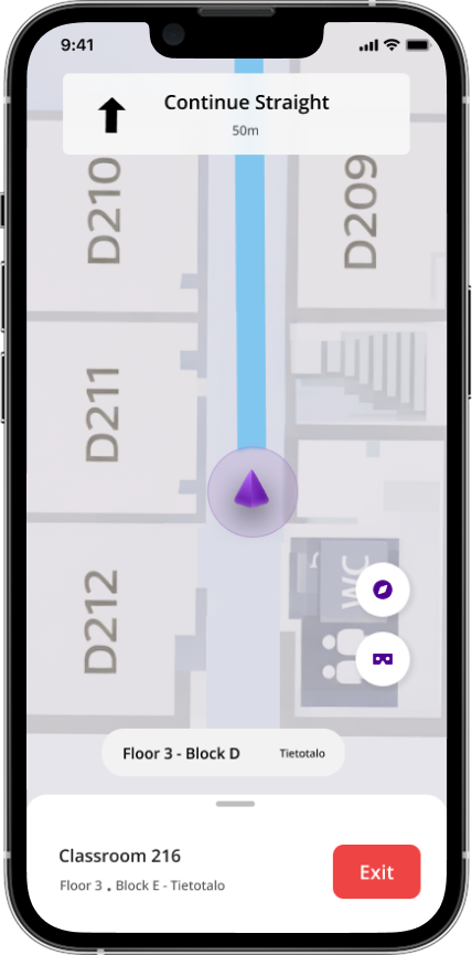
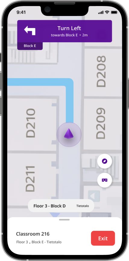
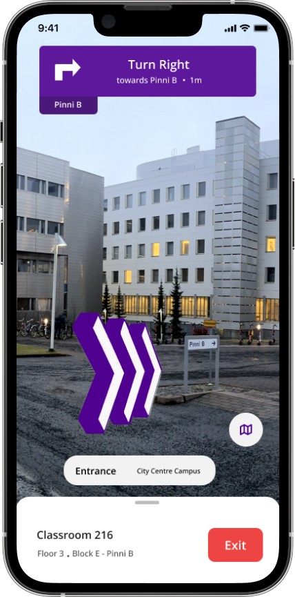
1. Decision-Node Amplification
Increasing clarity where directional commitment is required
Research showed that navigation hesitation consistently occurs at decision nodes – locations where users must choose a direction. These include corridor intersections, entrances, and staircase junctions.
At these points users often stop walking, rotate to reorient themselves, repeatedly check their phone, or ask nearby people for confirmation.
To reduce this hesitation, the interface increases directional clarity as users approach these nodes. Instructions become more prominent and directional cues are visually reinforced, allowing users to confidently commit to the correct path without needing to interpret the map.
By focusing guidance at these moments, the system reduces the uncertainty that previously caused navigation breakdowns.
Reduce hesitation at moments where directional commitment is required.
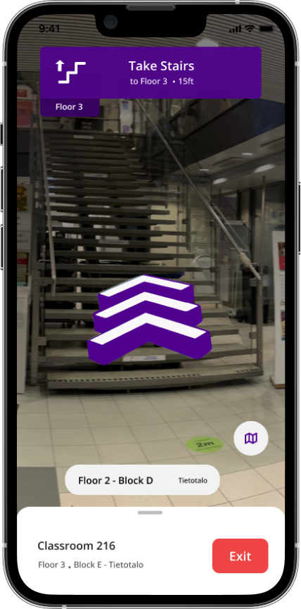
2. Hierarchical Spatial Anchoring
Maintaining orientation within the campus structure
Another major challenge identified during research was spatial hierarchy confusion. Students often knew their destination but were unsure whether they were in the correct building, floor, or section.
To prevent this disorientation, the interface continuously communicates spatial context using a consistent hierarchical structure:
Campus → Building → Floor → Block → Room
By keeping this context visible during navigation, users can easily understand how their current position relates to the destination.
This reduces the uncertainty that previously caused users to question whether they were navigating in the correct location.
Maintain spatial orientation throughout navigation.
3. Progressive Guidance
Adapting navigation clarity to the user’s movement state
Navigation requires different levels of guidance depending on the situation. During continuous movement through corridors or open areas, users typically need minimal instructions. However, as they approach decision points or their final destination, the need for clarity increases.
To support this, the interface adapts both information density and positional precision throughout the navigation process.
Movement → minimal guidance
Decision moment → amplified direction
Arrival → explicit confirmation
Early in the route the interface remains visually lightweight, allowing users to stay aware of their surroundings. As critical moments approach, instructions become clearer and more explicit.
Location certainty also increases as users approach their destination, preventing trust loss caused by fluctuating indoor positioning signals.
Provide the right level of guidance at the right moment while reducing cognitive load.
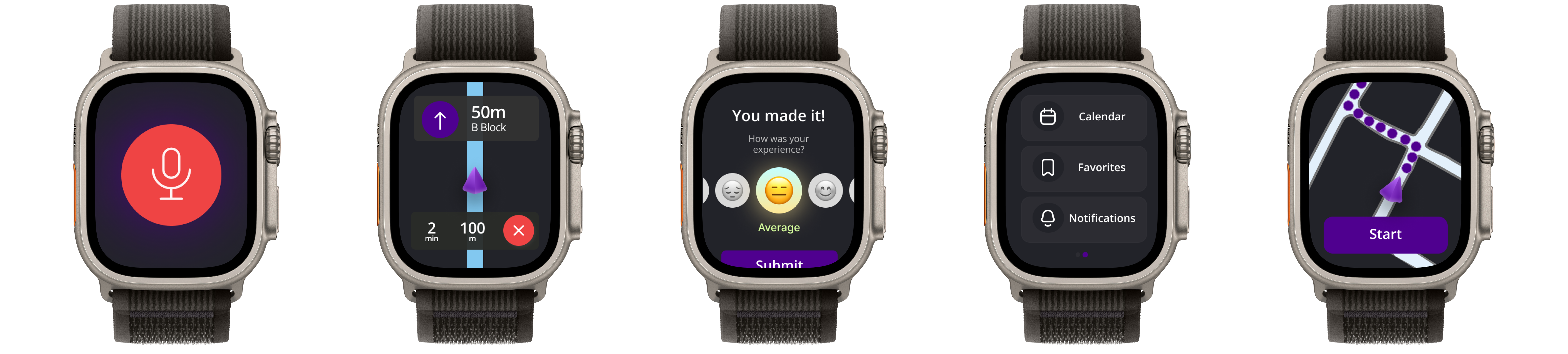
4. Cross-Surface Navigation Adaptation
Maintaining consistent navigation across devices
The navigation system was designed to work across multiple device surfaces while maintaining a single navigation logic model.
Mobile devices act as the primary navigation interface, displaying the map, route path, and contextual instructions. Wearable devices provide simplified directional cues that allow users to confirm their route without repeatedly checking their phone.
Although the interface changes across devices, the underlying navigation logic remains the same. This ensures users receive consistent guidance regardless of which device they are using.
Ensure navigation remains consistent across devices while adapting to each device’s interaction constraints.
Validation & Iteration
Testing whether the system reduced navigation uncertainty
After implementing the core navigation behaviors, the next step was validating whether the system reduced the hesitation and confusion observed during the initial research.
Rather than relying only on traditional usability feedback, the evaluation focused on behavioral signals tied directly to the project’s success criteria. The goal was to determine whether the system improved first-attempt navigation success by reducing uncertainty at critical decision points.
Testing was conducted through in-situ walkthrough sessions across campus buildings, where participants navigated to unfamiliar classrooms using the prototype. Observations focused on how users behaved while moving through the environment - particularly at entrances, intersections, and floor transitions where hesitation had previously occurred
The evaluation focused on the behavioral signals defined earlier in the project:
First-attempt navigation success
Whether participants could reach their destination without external assistance or backtracking.
Decision-point hesitation
The time users paused or slowed down when approaching intersections, entrances, or staircases.
Route deviation frequency
Instances where users left the intended path or corrected their direction.
Help-seeking behavior
Situations where users asked nearby people for confirmation or directions.
Testing revealed several important improvements in navigation behavior.
Reduced hesitation at intersections
Participants were able to commit to directions more quickly when approaching corridor intersections and entrances. The amplified guidance at decision nodes helped users choose a path without repeatedly checking the map.
Improved spatial orientation
Participants reported feeling more confident about where they were within the building structure. The persistent display of building, floor, and block context helped them maintain orientation while navigating unfamiliar environments.
Lower learning curve through familiar navigation patterns
An important observation during testing was how quickly participants understood the interface. Instead of introducing a completely new navigation interaction, the system intentionally followed familiar patterns used in common navigation applications.
Because most users were already familiar with map-based navigation experiences such as Google Maps, they were able to immediately understand how the interface worked. This reduced the learning curve and allowed participants to focus on navigating the environment rather than learning how to operate the application.
As a result, students were able to use the system confidently from their first interaction.
Clearer arrival confirmation
Earlier prototype versions created some uncertainty near the destination. Strengthening the arrival confirmation state eliminated this hesitation and allowed participants to confidently complete navigation tasks.
Based on testing observations, several improvements were made to strengthen the navigation experience.
Stronger decision-node guidance
Directional cues near intersections were made more visually prominent to ensure they were easily noticeable while walking.
Clearer transition messaging
Instructions for staircase and floor transitions were simplified to reduce confusion during vertical movement.
Improved arrival confirmation
The arrival state was redesigned to clearly communicate that the destination had been reached, eliminating last-meter uncertainty.
Refined use of familiar navigation patterns
The interface continued to align closely with familiar map navigation patterns to maintain intuitive interaction and avoid unnecessary learning overhead.
Outcome
Following these iterations, participants were able to navigate to unfamiliar locations with less hesitation, fewer route corrections, and reduced reliance on external assistance.
These results indicate that the navigation system successfully addressed the core challenge: Increasing first-attempt navigation success by reducing uncertainty at critical decision points.
Impact
Improving navigation confidence across campus environments
The goal of TUNI Compass was not simply to create a campus map, but to improve first-attempt navigation success by reducing uncertainty during movement. By focusing on decision-point guidance, spatial orientation, and familiar navigation patterns, the system aimed to help users move through complex campus environments with greater confidence.
Testing and observation indicated that the navigation system successfully addressed several of the behavioral challenges identified during the research phase.
Reduced hesitation at decision points
One of the most consistent improvements observed during testing was the reduction of hesitation at navigation nodes such as corridor intersections, entrances, and staircase transitions.
Because the interface amplified guidance as users approached these moments, participants were able to commit to directions more quickly without repeatedly checking the map or stopping to interpret their surroundings.
This directly addressed the initial behavioral pattern where users would pause, rotate to reorient themselves, or seek confirmation from others.
Improved spatial orientation
The continuous display of spatial context – including building, floor, and block information – helped participants maintain a clearer understanding of where they were within the campus structure.
This hierarchical anchoring reduced the uncertainty that previously occurred when users moved between floors or sections of a building.
Participants reported feeling more confident that they were navigating within the correct location even when the surrounding architecture appeared similar.
Faster adoption through familiar navigation patterns
An important contributor to the system’s usability was the decision to follow familiar navigation patterns rather than introducing a completely new interaction model.
Because most students already have experience using map-based navigation applications, they were able to understand the interface immediately without requiring tutorials or onboarding.
Leveraging these existing mental models reduced the learning curve and allowed users to focus on navigating the environment rather than learning how to operate the application.
As a result, students, visitors, and staff were able to use the system confidently from their first interaction.
Reduced reliance on external assistance
During earlier observations, users frequently relied on social fallback behaviors such as asking nearby people for directions or confirming their location with administrative staff.
By strengthening directional guidance, spatial context, and arrival confirmation, the system reduced the need for this external validation.
Participants were able to complete navigation tasks independently, which suggests the system successfully increased navigation confidence.
Foundation for a scalable campus navigation system
Beyond improving individual navigation tasks, the project also established a framework that can scale across multiple campuses and buildings.
The navigation model – based on spatial hierarchy, decision-node guidance, and cross-surface interaction – provides a structure that can support future campus expansion, additional buildings, and new navigation features without redesigning the core interaction model.
This makes the system adaptable for long-term use across the university environment.
Reflection
Designing navigation as a confidence system
One of the most important lessons from this project was that navigation problems are often not information problems, but confidence problems. Students generally had access to maps and building information, yet they still struggled to reach destinations because they were uncertain about their decisions at key moments.
This project reinforced the importance of designing for behavior under uncertainty. Instead of focusing solely on route optimization or map accuracy, the design focused on reinforcing confidence at the moments where hesitation actually occurs – particularly at intersections, entrances, and structural transitions.
By shifting the product from a map tool to a confidence-centered navigation system, the experience was able to support how people naturally move through physical environments.
Designing for real-world movement
Another key learning was the importance of designing interfaces that function well while users are physically moving.
Unlike many digital interfaces where users are stationary and fully focused on the screen, navigation requires users to divide their attention between the interface and the environment around them.
This meant the design had to balance clarity and simplicity, ensuring that the interface remained readable and helpful without overwhelming users with excessive information. The concept of progressive guidance, where the interface adapts to movement and decision moments, became central to achieving this balance.
The value of familiar interaction patterns
An important design decision was intentionally following familiar navigation patterns instead of introducing a completely new interaction model.
Most students already understand how map-based navigation applications work. By leveraging these existing mental models, users were able to immediately understand how to use the system without needing tutorials or onboarding.
This significantly reduced the learning curve and allowed users to focus on navigating the campus environment rather than learning a new interface.
The project reinforced that innovation in product design does not always mean creating new interaction paradigms. In many cases, building on familiar patterns can create a faster, more intuitive experience.
Systems thinking beyond a single interface
Finally, this project highlighted the importance of designing navigation as a system rather than a single interface.
The layered architecture – including positioning, navigation logic, reinforcement, and surface adaptation allowed the system to remain reliable across multiple buildings and campuses while also supporting different devices.
By separating navigation logic from interface surfaces, the system can expand across new campuses, buildings, and future navigation technologies without requiring fundamental redesign.
This approach helped ensure that TUNI Compass is not just a navigation application, but a scalable campus navigation framework.
Looking forward
Future iterations of the system could further enhance navigation confidence through features such as real-time occupancy signals, accessibility-aware routing, and contextual campus services.
However, the core lesson from this project remains clear:
"Effective navigation design is not just about showing directions - it is about helping people feel confident that they are moving in the right direction."
Appendix
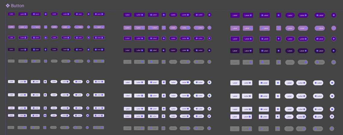
Color System
TUNI Compass follows the Tampere University brand guidelines, which define a set of official brand colors used across the university’s digital platforms.

While these colors work well for standard digital communication, designing a navigation-based mobile application requires a broader color scale to support elements such as route indicators, hierarchy labels, states, and accessibility considerations.
To address this, a comprehensive color palette was derived from the university’s predefined colors. The palette was created by generating tints, shades, and tones of the base colors, allowing the interface to maintain brand alignment while supporting a wider range of UI states and components.
Derived Color System
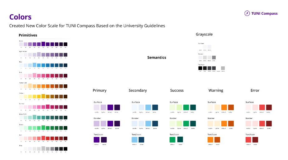
The complete color system was implemented in Figma using variables and modes, enabling consistent usage across components and supporting scalable design updates.
Typography
According to Tampere University’s digital guidelines, Open Sans is the standard typeface used across university platforms.
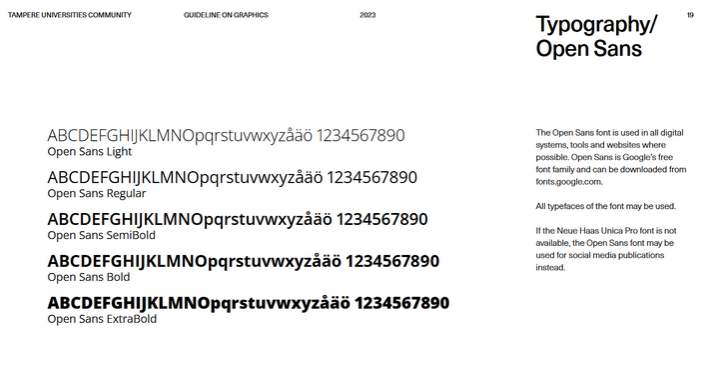
To ensure readability and consistent hierarchy within the mobile interface, a dedicated typography scale was created for TUNI Compass using Open Sans. The scale follows a Major Second (1.125) ratio, which provides subtle and balanced progression between font sizes. This scale was selected because it: supports clear hierarchy in dense mobile interfaces maintains visual consistency with existing university platforms adapts well across multiple screen sizes and devices.
Created Typography Scale
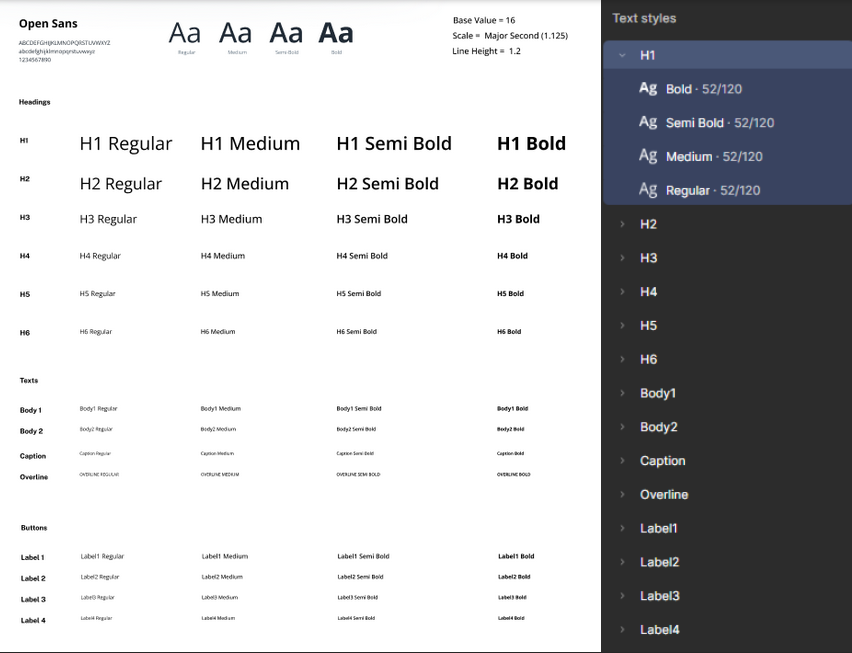
This structured typography system ensures that navigation instructions, spatial hierarchy labels, and contextual information remain clear, readable, and consistent across the application.
Information Architecture

Low Fidelity Prototyping

High Fidelity Prototyping

Component Design
The initial interface concept followed the visual style defined in the university’s brand system, which primarily uses sharp-edged, angular elements.
During design exploration, this approach was adjusted to better suit a mobile navigation experience.
To improve usability while maintaining the university’s visual identity, the component system evolved into a balanced approach that combines angular (angular bias) and rounded elements (contour bias).
The result is a component system that feels adapted for mobile interaction while still remaining clearly aligned with the university’s design system.

“Closer to the human, the rounder it is” – Naoto Fukasawa
Accessible Placements
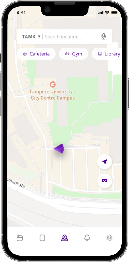
We deliberately positioned the important buttons on the right side of the map interface, including AR and accessibility buttons. This design choice was carefully considered to optimize user interaction, particularly recognizing how most users naturally hold their mobile devices. By placing icons within easy reach of thumbs, we enhanced overall navigation efficiency, making the application more user-friendly.

User Motivation Techniques
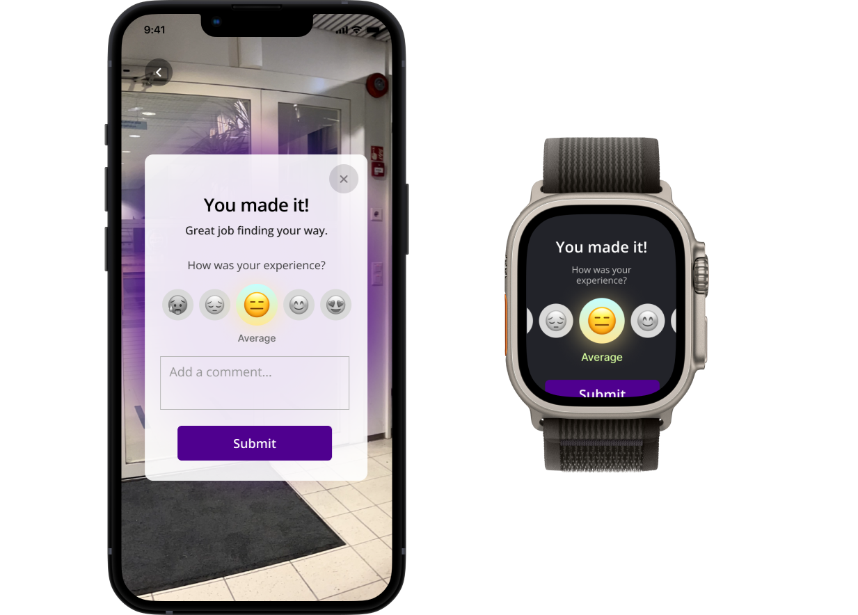
Positive reinforcement - We implemented nudging techniques for user motivations. For example success messages when users reach their destination. (Positive reinforcement, celebrating the user's successful navigation.)
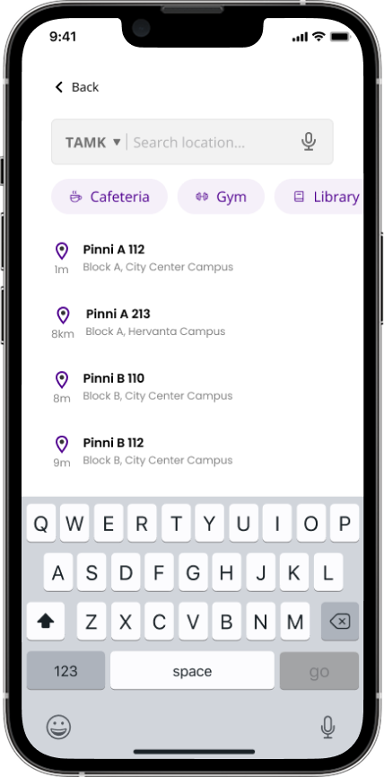
Choce architecture - Important locations such as cafeterias, help desks, and common campus facilities are visually highlighted on the map. Frequently used actions like starting navigation or saving favorite locations are also simplified to reduce interaction steps and make the interface easier to use.
Time-based nudges - Timely reminders ensure users stay on track. If a user has a linked schedule, the app might suggest, "You have a lecture starting in 15 minutes. Here’s the fastest route to get there."
Context-aware nudges - The app adapts to user needs by providing context-specific prompts. For instance, users selecting accessibility options are guided to routes with ramps or elevators, while those struggling to locate landmarks are nudged to activate AR mode for easier navigation.
Progress indicators for navigation - The app provides visual progress indicators along routes, showing users how close they are to their destination. Milestone updates, such as reaching key landmarks like a main building entrance, keep users informed and motivated to complete their journey.
User Experience Feedback
Recognizing the importance of continuous improvement, we added a small feedback mechanism within the destination-reach pop-up. This approach allows users to provide immediate insights into their experience. Our choice was driven by the desire to gather real-time, contextual feedback that can inform future iterations of the application.
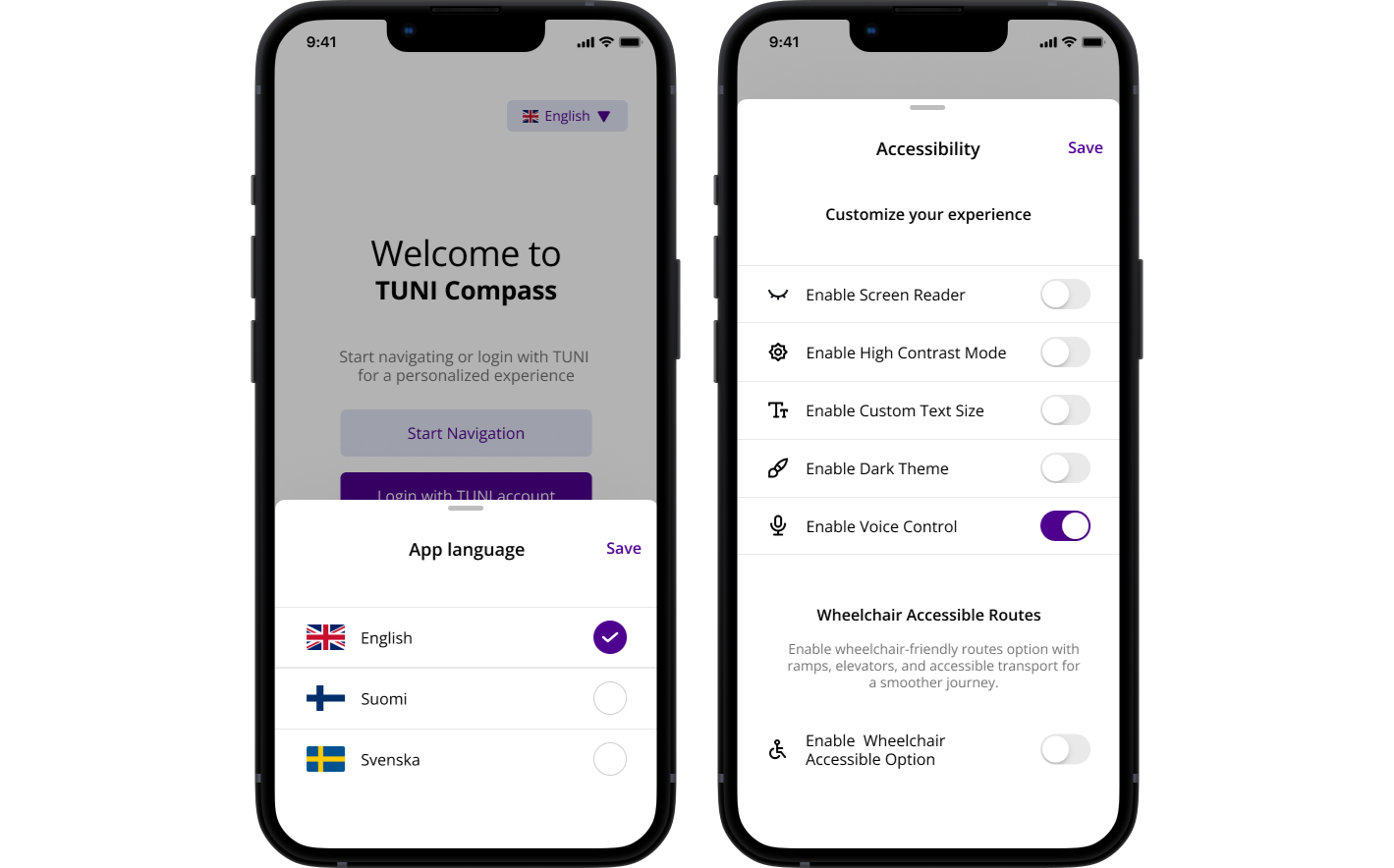
Accessibility and Multilingual Support
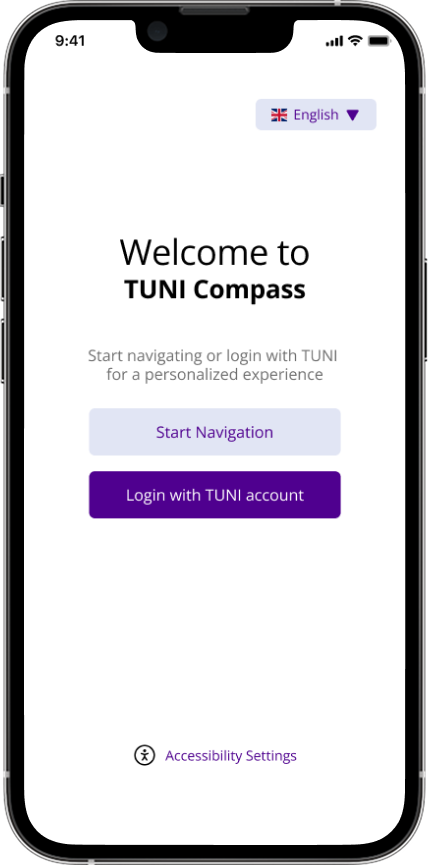
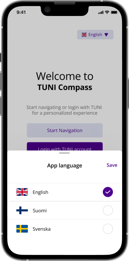
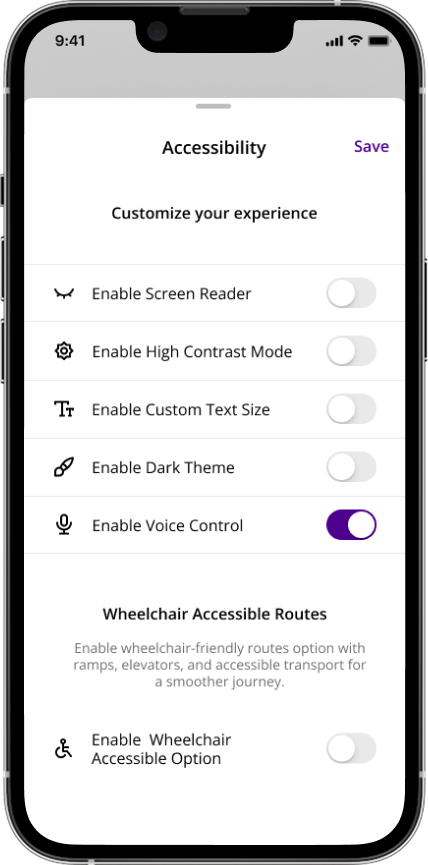
Initially conceptualized with limited language and accessibility options, we expanded the application to support three languages (English, Finnish, and Swedish) and implemented comprehensive accessibility features. These include screen reader compatibility, high-contrast mode, adjustable text size, dark theme, voice control, and a wheelchair accessibility routing option. Our reasoning was to create a truly inclusive application that serves diverse user needs, ensuring that students and visitors with different abilities and language backgrounds can navigate the campus effectively.
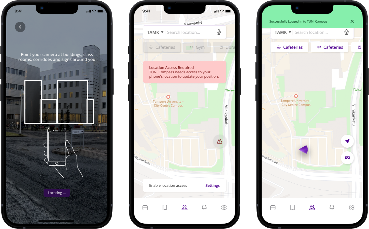
Visibility of System Status
keeping users informed about the system's status is essential for a smooth and reliable experience. For example, when a user scans their surroundings to initiate navigation, the app should provide feedback if the environment is difficult to detect such as when there’s low lighting or reflective surfaces that could hinder AR tracking. Additionally, when directions or virtual indicators are loading, users should be notified to prevent confusion and frustration. This real time feedback ensures users always know what the system is doing, reducing uncertainty, and increasing their confidence in the app.
Interested to see the process of this project?
Explore the design process